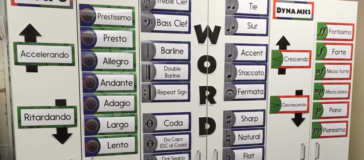
What Every Music Teacher MUST Have on their Walls!
 The last school I worked at actually had a diagram of which bulletin boards should go in which spots in the classroom. They had a very specific expectation of WHERE and WHY something should go in a certain place. In fact, my new teacher orientation had a full hour session on bulletin board placement and purpose.
They had good intentions. They wanted each room to be uniform so that students could walk into a class and quickly understand the goals, standards, and expectations for the day. But the problem is that one of the required bulletin boards was a spot for “Reading Street,” and guess what… I don’t teach Reading Street. The whole time I was sitting there thinking of this quote from Tina Fey’s book called Bossypants:
When people say, “You really, really must” do something, it means you don’t really have to. No one ever says, “You really, really must deliver the baby during labor.” When it’s true, it doesn’t need to be said.”
- Tina Fey in Bossypants
Make Sure It’s Accessible for Kids!
Head or Higher – Waist or Lower
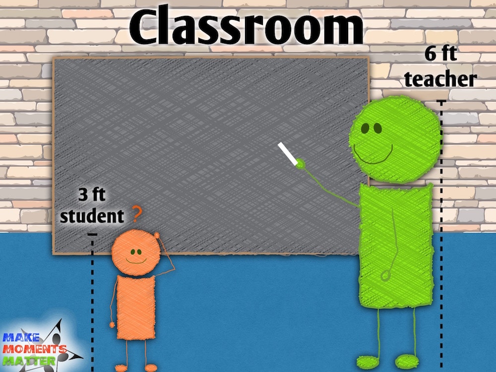
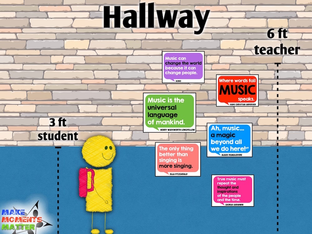
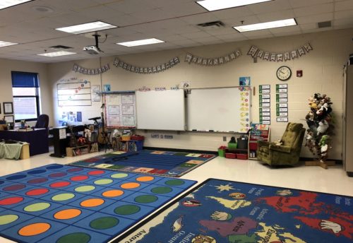
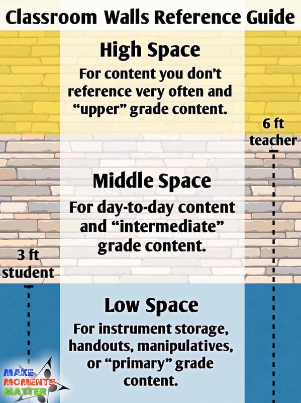 Whenever I’m setting up my classroom or thinking about bulletin board content I always try to take my audience into account and what would be easy for them to see. My handy rule of thumb is to think “Head or Higher – Waist or lower.”If the space is above my head then it should be used for upper elementary content or anchor charts/posters that I don’t use very often. I say this because older students are more used to looking up and can easily see and read posters that are high. I also suggest you put anchor charts or content you don’t use every day (like recorder fingering charts or instruments of the orchestra) up high so that students can still access the material, but it’s not taking up “prime real estate.”If the space is my waist or lower then it should be used for instrument storage, handouts, manipulatives, or other things that students grab and use regularly. I would also say that this lower space is best for primary grade content and should be the posters that they might need if you’re sitting “criss cross” and looking at the wall. This could be posters of “the four voices,” song visuals, or something similar.That leaves the middle space. This space inbetween waist and head should be where all your important “I use this with all my classes” stuff should go. Whiteboards, solfege hand signs, musical form posters, word wall (if you have that), and other day-to-day materials all go here in that middle space.
Hallway vs. Classroom
Make Sure It’s Worth Your Time!
It all started with something I saw on Pinterest…. (and isn’t that how all black-hole, time suck projects start). I saw this pin with an amazing timeline where pictures and reference material sparkled off the timeline making each piece come to life. I thought that I could easily replicate that idea with music history and at different points in time I could show composer pictures or when instruments were invented or the different musical periods. I found some really cool composer profile posters in my classroom closet and then some awesome clip art for instruments online.Then came the conundrum of where the timeline would go. What would have to come down for it to go up? I also had to think about how all those things would stick to the wall. Would I connect them with string? How far back in time do I go and how do I fit all the things that I want to include? So many questions and never enough time. The project was never completed…
 Don’t let a Pinterest idea suck away all your time!
Pinterest – Friend or Enemy?
 Pinterest should be a friend, not foe!
Pinterest can be your friend or your enemy. Don’t get over excited about something that will take too much time! Pin it, think about how it would work, and decide if it’s worth your effort. If it’s not, move on! Don’t spend hours and hours creating that beautiful door decoration if you haven’t put anything on the walls of your classroom. Don’t make a huge paper mache “learning tree” if it doesn’t match the content and theme of what you’re teaching THIS YEAR.I would also caution you to choose wisely and don’t be blinded by your momentary inspiration when you find pre-made content online (Teachers Pay Teachers or other sites). You can find a lot of amazing resources on TPT and all it takes is a “click” to download, but not all of the files on TPT are worth your time and effort to actually create and hang if they don’t directly serve your teaching goals. Don’t print out something that is NOT worthy of all the time it will take to ask your secretary to print in color, fight with the laminator, cut with the dull scissors that you still have in your teacher desk, and use “the right kind” of sticky tack to put up on your wall. When time is of the essence, it’s important to choose wisely. Don’t buy and print out that word wall kit if you won’t actually use it. Don’t feel pressure to fill empty space just because it’s empty. Be intentional about what you put on the wall and make sure it’s worth your time.
Make Sure it Enhances Learning!
Why do we hang pictures of old white dudes on our walls?
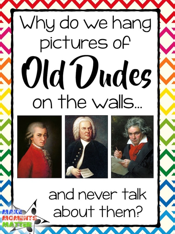 Why do we put up pictures of old white composers on our walls? Sure Bach, Mozart, and Beethoven are important to the history of music, but how often will we talk about them in our teaching? I love to always go back to the question “But does it enhance student learning?” I would say that in most cases, pictures of composers do not enhance student learning.Think about all the classes that come through your door and see old white dudes on the wall but don’t know who they are or why they are significant. Those men might be presidents for all they know. They must be important if they get a permanent space on the classroom wall…
Maybe you reference the composers all the time or at least take the time to point out who they are and why they are important. If so, that’s great! But don’t feel like you have to put their pictures on the wall because 1) you have the posters already sitting in the closet, 2) you have the blank space on your wall and 3) you have a vague feeling of obligation to put their pictures up because they contributed to the history of music.
If you don’t reference who the composers are and why they’re important enough to go on the wall students just see the image. In this instance you are unintentionally teaching the students that white men are important. So, either you should talk about them more often (do a composer of the week where you spend 1 minute saying his/her name and play a tiny snippet of their music), add in some women and/or people of color (HERE is an example of how to teach kids about female music makers- easy to do! and HERE is an example of how to include people of color), or just take down the composer pictures and put something else up.
The Curse of Cute
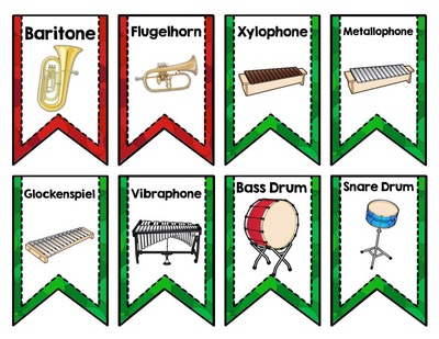
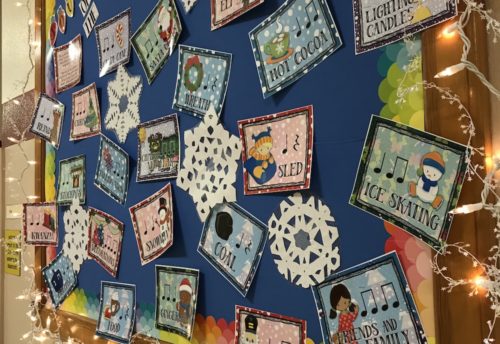
 It is far too easy to decorate your classroom and fall victim to the “curse of cute.” Visit nearly any kindergarten classroom and you’ll see cute clip art, curely/kidsy fonts, stuffed animals, tiny tables, and endless crayon crafts. Your heart will “sqeeeeeee” with adorable excitement. It’s just a given.I always try and remember the mantra: “Cute is cute, but content is king.” We all love to create colorful and catchy bulletin boards with adorable images of kids and music notes. Just make sure that what you display in your classroom is also teaching content. There is absolutely no shame in getting on Teachers Pay Teachers and finding some cute things to print out, but don’t buy those adorable posters on TPT just because they are adorable. Buy them because they are a graphically engaging way to display the content that you want to teach. Again, be intentional about what you put on the wall and make sure it’s worth your time.
Also, when you decorate your classroom you should think about all age ranges and all students who walk through your door. As a man, I am constantly reminded to think of how I can keep my classroom gender neutral. I don’t want to fill the room with fluffy poof balls, pinks/purples/teals, stuffed animals, and cutesy clip art. While none of those things are inherently gendered, it may appeal to one segment of a class over another. I don’t want anything I put up in my classroom to turn off any group of kids be it boys or girls. That doesn’t mean putting up “football themed” stuff to balance out the “fairy themed” posters. It doesn’t mean getting rid of all cute pictures or poof balls or streamers either. It just means that we need balance.
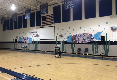
I also want to think about what ages are coming to my classroom. Last year my room had to accommodate kids from Kindergarten through 8th grade. I really had to be intentional so that primary grades felt welcome and encouraged in the room and that middle schoolers didn’t feel like the room was too “little kid” or “cutesy.” This is one of the reasons that the music room decor sets I create and use in my own classroom are not themed. I create colorful and engaging visuals for each of these sets, but they are not themed around any particular place or idea (ocean, fairy land, safari, etc.) I link the decor sets together with a color scheme and similar pictures of clip art kids, but I try and stay away from anything too gender-specific or age-specific. There’s nothing wrong with those themed decor sets but again, think about balance and every kid who walks in the door.If you look at your classroom and think, “OMG, I am living in a pink, poof ball, Precious Moments classroom,” don’t go and pull everything down. Just think about what’s appropriate for all students at all ages and remember: “Cute is Cute, but Content is King.”

14 Comments